


I use simple composition strategies to enhance my artwork.
When people find art intriguing without knowing why, it's all about composition! It's the arrangement of elements within a work of art, making it visually appealing and impactful.
When starting your anime art journey, learning different composition techniques helps you guide the viewer's eye and create engaging art.
Through a deeper understanding of composition and implementation of these techniques, you can evoke a strong emotional response from viewers.
Which means you'll have the potential to attract more attention, leading to increased visibility and potential for success in your art career.
As they say, it's not just about what you see, but how you see it.
And composition is the key to unlocking that powerful connection between artwork and viewer.

What is Composition in Art?
So, what's the composition?
In simple terms, it's how design elements like lines, shapes, colors, and textures are placed in a piece. This organization can greatly affect the artwork's look and message.
The key method for composition is using principles of design (such as balance, unity, contrast, and rhythm) to arrange those elements effectively.
Balancing these elements is crucial for making visually appealing compositions.
As beginners, it is important to familiarize ourselves with these elements and understand how they work together to create a strong composition. And you'll learn all of this in the section below!
Learn the Key Elements of Design
Understanding the key elements of design is a great place to begin. They're the central visual element that every artist should comprehend.
These elements are as follows:
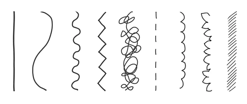
- Line: Lines are the fundamental building blocks of art. They are the marks or strokes that define the edges and contours of objects, creating a sense of form and structure.
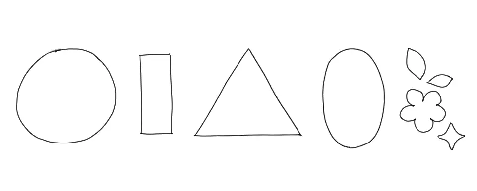
- Shape: Shapes are two-dimensional, enclosed areas defined by lines. They can be geometric, like circles and squares, or organic, like the outline of a leaf.
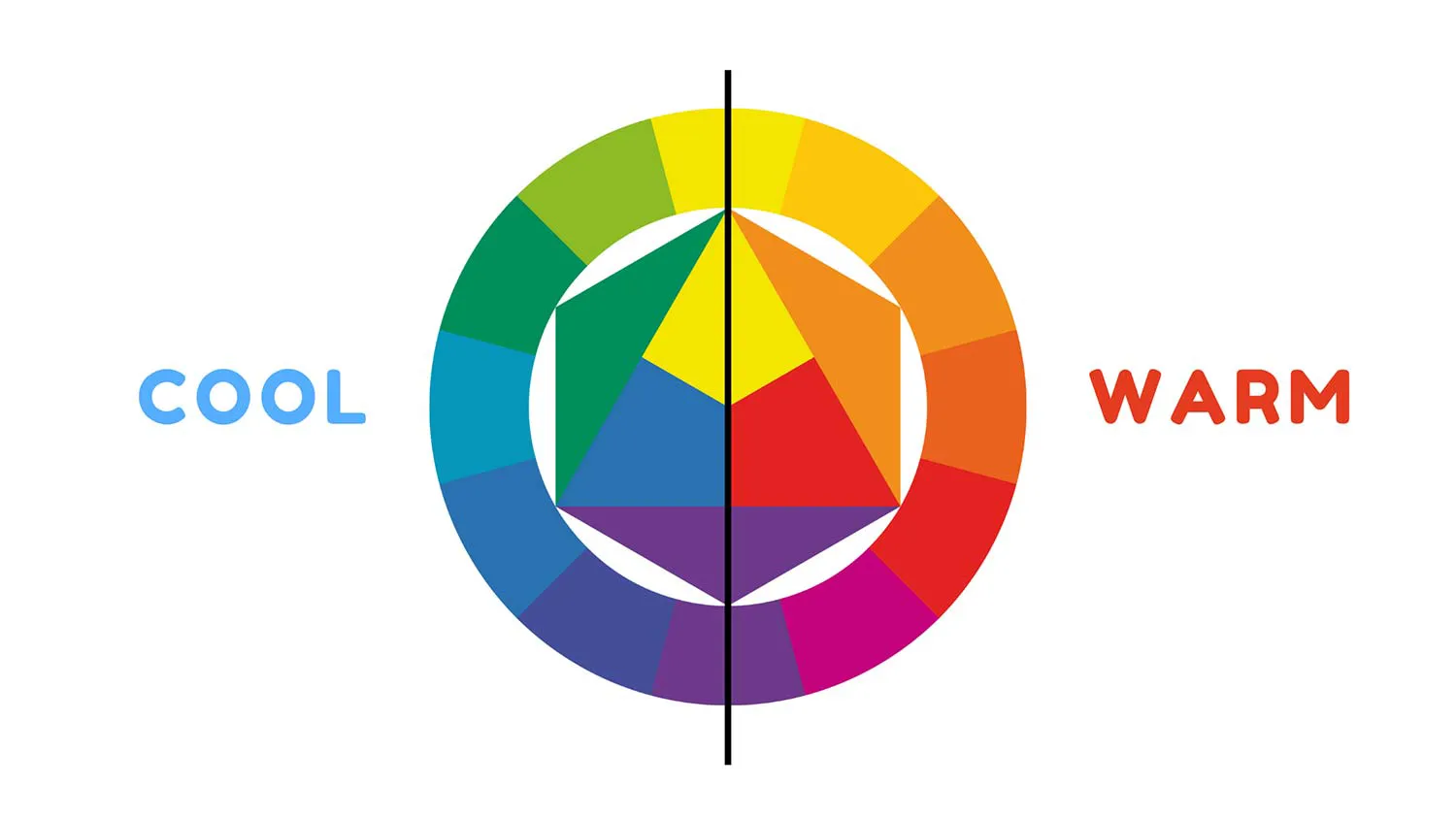
- Color: Color is the visual sensation produced by different wavelengths of light. It's a key element in art, conveying emotions, moods, and adding depth to visual compositions.

- Texture: Texture refers to the tactile quality of a surface, whether in real life or in art. Artists use various techniques to create the illusion of different textures, like smoothness or roughness.
- Value: Value is the degree of lightness or darkness in an artwork. It's essential for creating contrast, defining forms, and adding depth through shading.

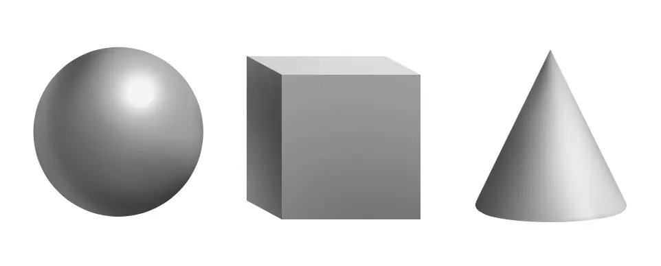
- Form: Form refers to the three-dimensional quality of objects in art. It conveys the perception of depth, volume, and the way light interacts with surfaces.
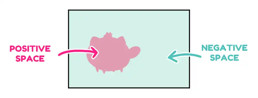
- Space: Space in art is the area within and around objects. It involves the arrangement of elements in a composition to create a sense of depth, perspective, and the illusion of distance.
These are the building blocks of composition!
By learning about these elements and how they work together, we can effectively use them to create a strong composition and capture the viewer's attention.
4 Principles of Design to Composes the Elements
Principles of design is a structured framework for arranging various design elements such as lines, shapes, colors, and textures.
It's essential to grasp the four key principles of design: Balance, Unity, Contrast, and Rhythm. While there are numerous design principles out there, focusing on these four will help you start learning without feeling overwhelmed.
#1 Balance: The Equilibrium
“Balance” is the key to composition. This refers to the distribution of visual weight in a composition and can be achieved through symmetrical or asymmetrical arrangements.
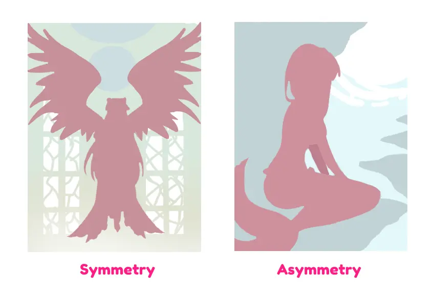
Symmetry, characterized by the exact mirroring of elements on both sides, imparts a sense of balance, order, stability, and formality to the composition.
In contrast, asymmetry brings a compelling dynamic to the composition, where the two sides are not identical but maintain an equilibrium of visual weight. This approach results in an engaging and visually captivating experience for the viewer.
#2 Unity: The Harmony of Elements
Unity plays a significant role in creating a sense of cohesion and harmony within a composition.
This sense of unity can be thought of as various elements working together to achieve a harmonious and complete effect.
When it comes to art, unity comes to life by strategically employing similar elements and arranging them in a manner that fosters a sense of “oneness.” In doing so, the artwork transcends individual parts and becomes a unified and harmonious whole.
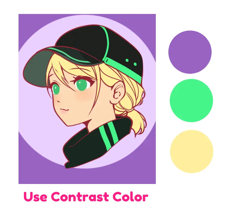
#3 Contrast: Amplifying Visual Impact
Contrast involves putting different elements side by side to create meaning and make certain aspects stand out.
It's all about using differences, like shadows, light, color, and size, to make your art more interesting and emphasize specific details.
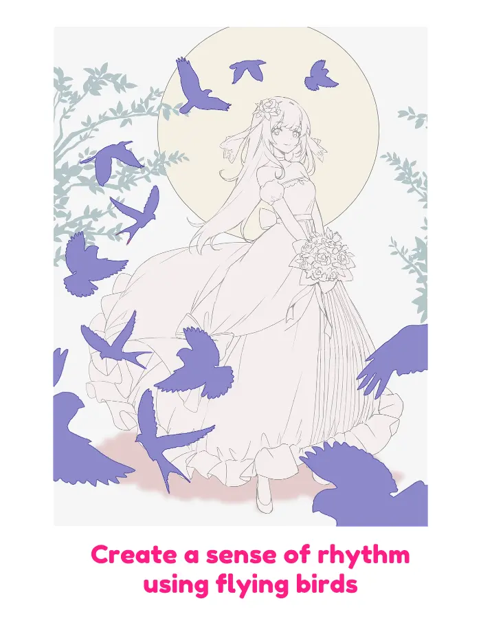
#4 Rhythm: The Artistic Movement
Rhythm in art means the way things move and flow in a picture. It's like the rhythm in music, some art is calm, while some is more lively.
Just as music has different speeds, so does art. This rhythm helps guide your eye and can make art interesting and full of energy. If the rhythm is not regular, it might even add a bit of surprise to the art.
My Steps to arrange Elements in Artwork
Now that you've got a grasp of design elements and the principles of design, let's arrange them in your illustrations.
I'll share my proven steps for crafting great compositions in my art.
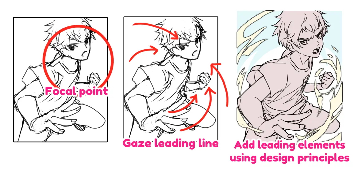
Step #1: Find the focal point
Every great composition starts with a focal point. This is the heart of your artwork, the place that naturally draws the viewer's eye.
To begin, identify this focal point, as it will be your guiding star throughout the process. This step ensures that your art communicates its message effectively.
The focus can be whatever you want to show in the picture, like the energy of a character, a big explosion, the sadness of a battlefield, or diecious food!
In my case, the focus point is always the lively or powerful character since I work with a game company to produce a character card for their game.
Step #2: Guide the viewer's eye
Once you've identified the focal point, use design elements like lines, shapes, and colors to guide the viewer's gaze toward it. This keeps their attention where you want it.
Think about lines, shapes, colors (the key design elements I mentioned before), and how they can work together to direct the viewer's attention right to that pivotal focal point.
Step #3: Apply design principles
Now, it's time to put the principles of design into action. Elements like balance, unity, contrast, and rhythm are your allies when arranging elements harmoniously within your artwork.
All of these arrangements are directed toward the focal point you want the viewer to focus on while maintaining the overall balance of your art.
Pro Tips to Mastering Composition Techniques
In this section, I'll share the techniques I use in my artwork to craft captivating compositions!
Keep in mind that these tips aren't rigid rules; they're versatile tools you can adapt and combine to suit your unique artistry and style.
Your creativity has no bounds, so feel free to mix and match to create compositions that resonate with your artistic vision.
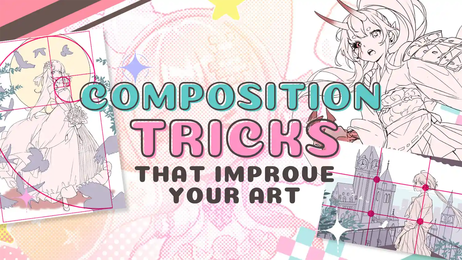
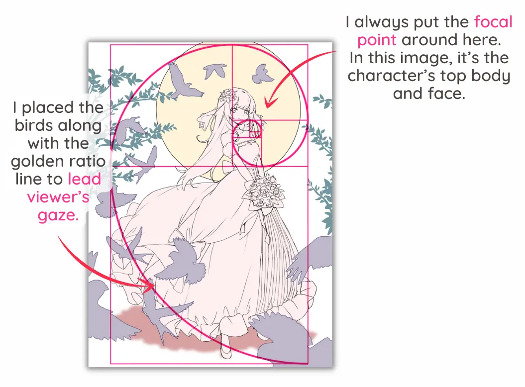
Apply The Golden Ratio
The golden ratio is one of the basic principles composition tips that often represented as the divine proportion.
It is also a mathematical concept that occurs naturally in many aspects of art and nature.
It's about creating a balanced and visually pleasing composition by dividing your canvas into specific proportions, typically around 1:1.618.
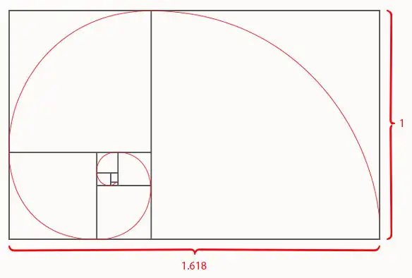
To apply this technique, consider placing your focal point or key elements along these divisions. For instance, you might position a character's face at the Golden Ratio's intersection to draw attention.
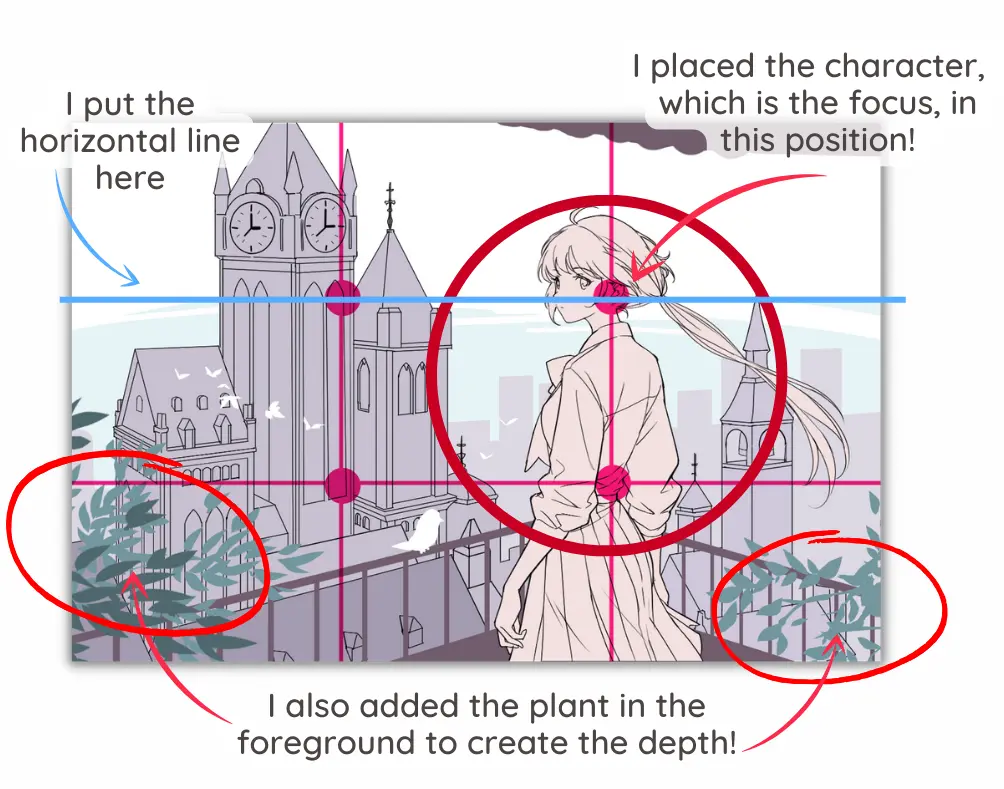
Apply Rule of Thirds
The Rule of Thirds divides your canvas into a 3×3 grid. It's about avoiding placing your subject or key elements dead center.
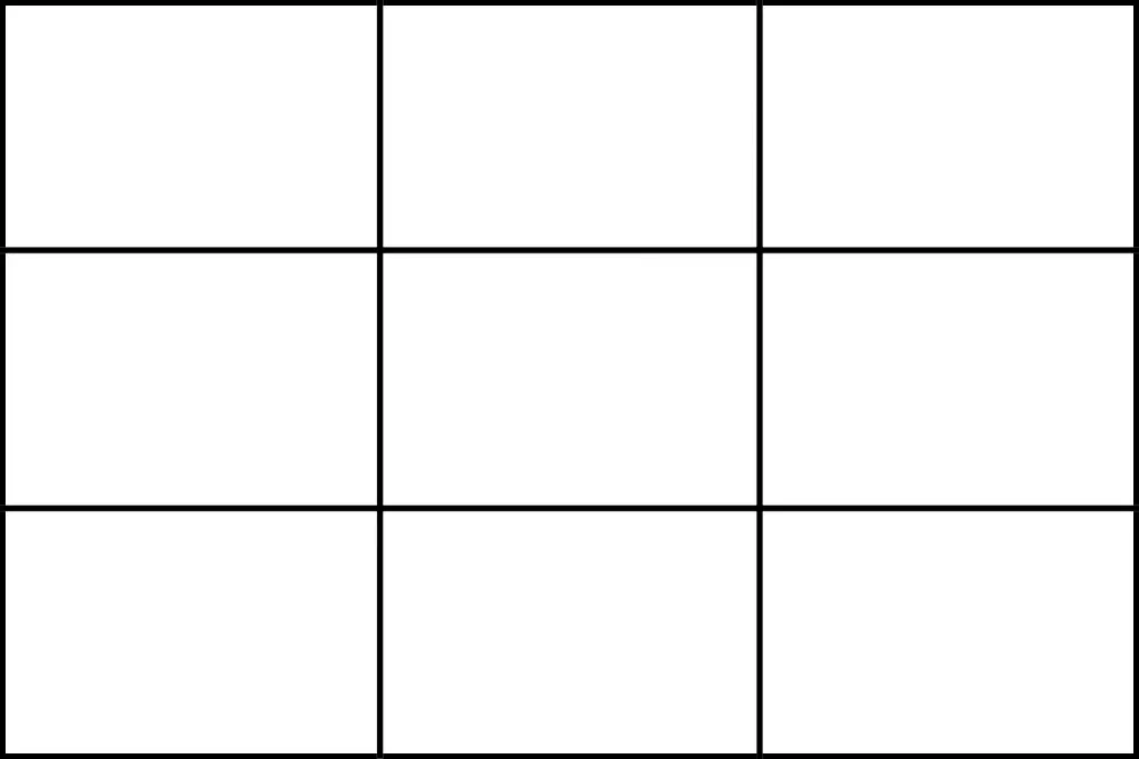
Instead, position them along the gridlines or their intersections. For example, if you're painting a landscape, consider placing the horizon on one of the horizontal lines. This technique creates a more dynamic and engaging composition.
Apply Rule of Odds
The Rule of Odds suggests that an odd number of subjects in your composition tends to be more visually pleasing than even numbers.
When arranging elements, consider using groups of three, five, or seven rather than pairs or fours.
For instance, if you're illustrating a group of characters, have three of them interact, creating a harmonious and dynamic scene.
Apply Rule of Space
The rule of space is about providing adequate space in the direction your subject is facing or moving. It creates a sense of balance and anticipation.
For instance, if your character is walking to the right, leave more space on the right side of the canvas to convey their movement and suggest what they're moving towards.
Lead the Eyes with Viewpoint
Perspective plays a pivotal role in crafting a sense of movement and emotional depth within your artwork. It involves a deliberate strategy to lead the viewer's eye naturally as they explore your composition.
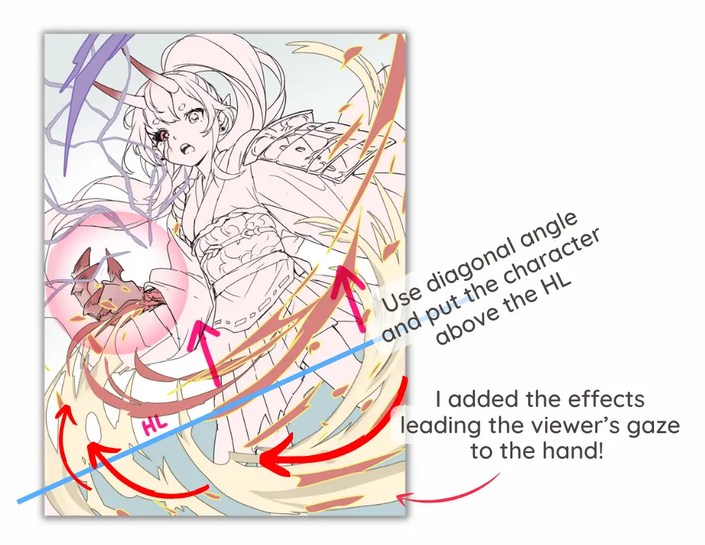
In emotionally charged scenes, positioning the character above the horizontal line, creating a looming presence.
Furthermore, using diagonal angle adds a disorienting element, reinforcing the feeling of being off-balance.
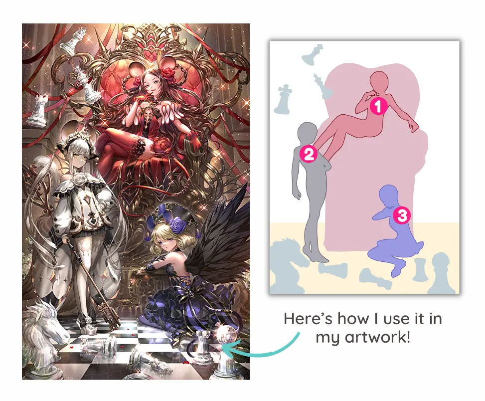
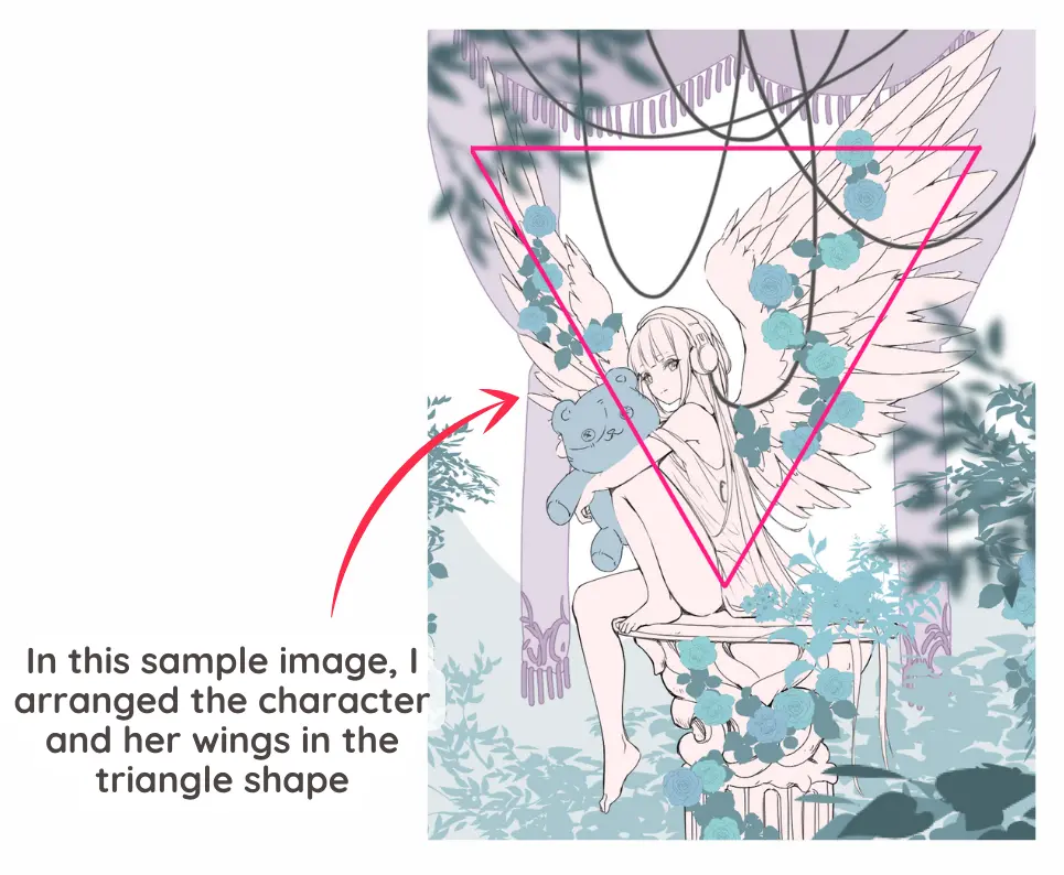
Use The Power of Triangle
The Power of the Triangle is about creating triangular arrangements within your composition.
Triangles are visually stable and pleasing shapes that can guide the viewer's eye. For example, if you have three key elements in your artwork, position them to form a triangular shape. This arrangement helps create an engaging composition.
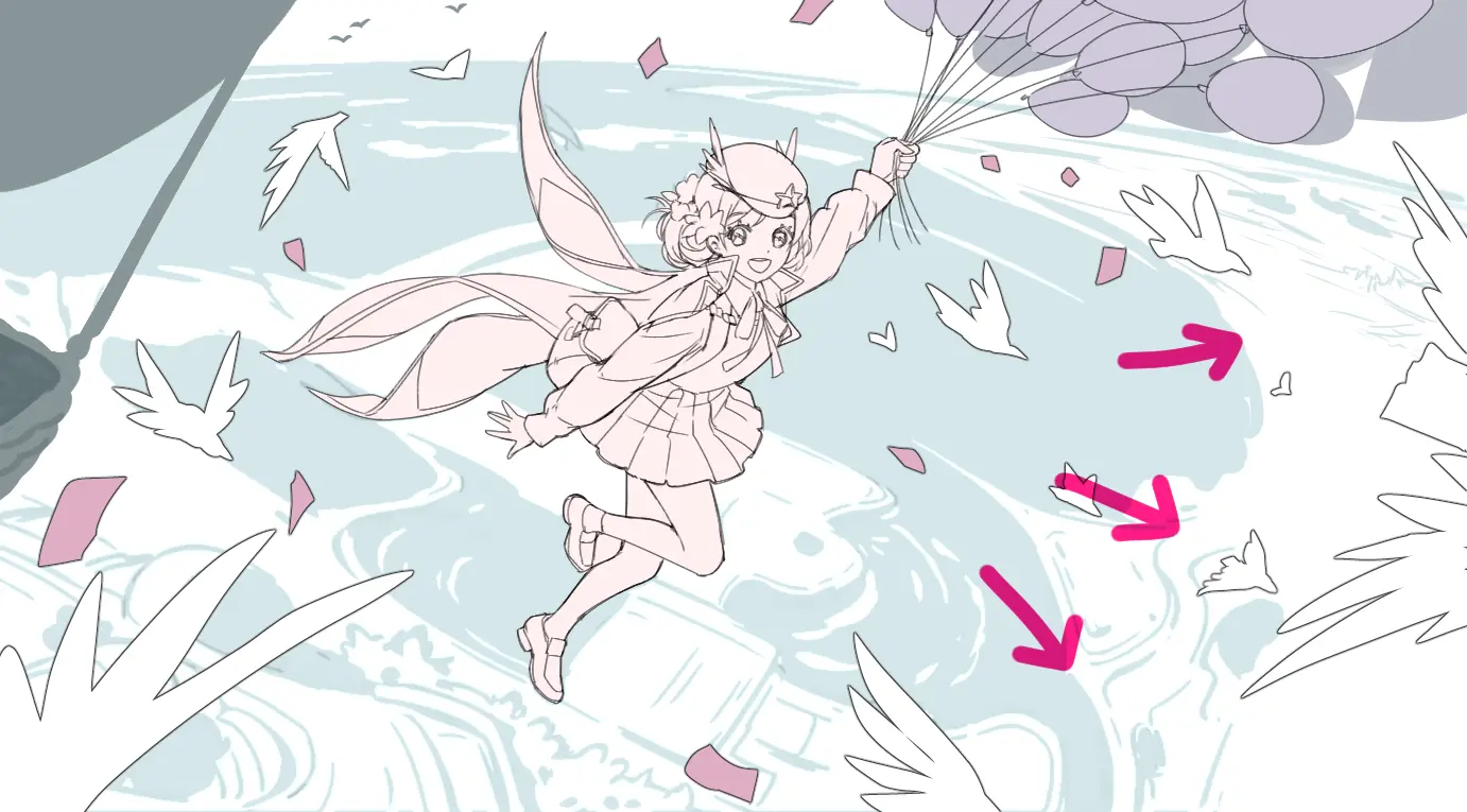
Use Leading Lines
Leading lines are lines within your artwork that lead the viewer's eye towards a specific point of interest. For instance, a road or river can lead the viewer's eye toward a distant castle.
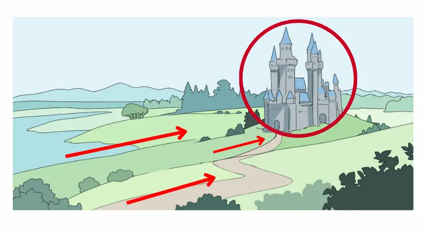
Implement this technique by incorporating lines or shapes that guide the viewer's gaze. Consider elements like winding paths, fences, or a character's outstretched arm, all of which can lead the viewer's eye to the focal point.
Now you've got the idea about how to utilize these elements of composition in art. Next, I'll share my personal tips you can use to come up with composition idea in your art.
Bonus: A Composition Matrix!
A composition matrix table is a powerful tool that artists can employ to unlock innovative composition techniques.
This method allows you to combine design elements and principles seamlessly.
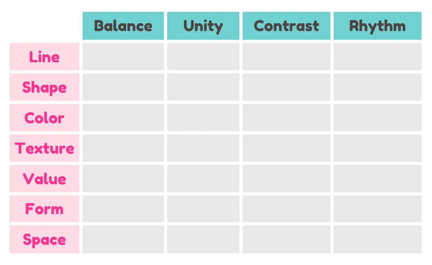
In each cell of the matrix, pair a design element with a design principle. For example, you can combine “shapes” with “contrast,” inspiring you to use distinct shapes to create a striking contrast in your composition.
As you explore different pairings in this table, you'll discover novel composition techniques. It's really helpful when you have an art block or want to come up with new composition ideas!
Conclusion
In conclusion, knowing about composition in art is like unlocking a special secret for making your art really cool!
It's all about putting things together in the right way to make your pictures look awesome. So, don't stop exploring and trying new things.
Keep learning and keep making your art better!
Finally, if you like art tips and content like this, feel free to subscribe to my weekly newsletter
I share my anime art tips and experiences in my digital art career in a weekly email. You'll get the insight and behind the scene of the art career! Really recommend if you're a beginner anime style artist.
Thank you so much for reading this post! I really appreciate your visiting and using your valuable time reading my content!
Much Love 💖

Want to know how to start your anime art journey?
Download my ANIME ART STARTER GUIDE and start your artistic path right away for FREE!